


The Process
Empathize / Exploring user's needs
This phase allowed us to create a strong foundation for the design strategy.
To learn more about designing for students, our group conducted 5 discovery interviews. The interviewees consisted of Readable English's CEO, a school psychologist, a 3rd grade teacher, a kindergarten teacher, and a language teacher.
Research Goals:
-
Understand how accessible and user-friendly the portal is for the targeted audience.
-
What usability challenges or frustrations do users encounter as they complete their lessons? Conversely, what is working well?
-
What, if any, features do users expect, or would like to change and/or are missing to make the portal visually appealing and easy to use?
Interview Findings & Takeaway
We conducted 2 interviews with the CEO of Readable English, Tim Waldron, to uncover key priorities, goals, expectations and constrains of our student portal redesign process.


The Solution
The Problem
A student portal redesign that improves usability and navigation, making it easier for students to access reading exercises and track progress, while providing clearer feedback for the student.
Readable English aims to support students who struggle with reading by providing a specialized learning platform. However, the current portal is difficult to navigate, making it hard for young learners to access the reading exercises and track their progress. This creates frustration for students, parents, and teachers who are looking for an intuitive and supportive
learning experience
IMPACT
After redesigning the Readable English student portal, we transformed the user experience by restructuring the layout for better clarity, incorporating captivating visuals to boost emotional engagement, and integrating subtle interactive animations that encouraged exploration. As a result, 96% of users remained actively engaged throughout their sessions, reporting that the platform felt more stimulating, enjoyable, and rewarding. The new experience not only improved usability but also fostered a deeper connection with the content, helping students stay focused and motivated during their learning journey.
Tools
Creating a more intuitive and engaging portal that supports students in their English Learning Journey
READABLE ENGLISH


Heuristic Evaluation
Through a navigation audit of the website, several usability issues and areas for enhancement were identified, highlighting opportunities to improve structure, clarity, and user flow

Pain Points:
-
While the original portal included some attempts at gamification, like the wordometer and badges, these features felt disconnected and out of place within the overall design.
-
Another key issue was the lack of separate sections for school and home, which was a critical request from our stakeholder.
User Errors:
-
Navigation uses icons instead of words.
-
The text used doesn't pass a color accessibility test
-
Confusing Interface elements like a misinterpreted search bar and unintuitive controls
Our color accessibility audit indicated that key Readable English colors do not pass WCAG and AAA guidelines in the way that they are currently displayed. This highlighted another point of focus for our designs.

Color Accessibility

DEFINE / Establishing the User's Needs and Problems
Persona Development
Based on our research, we created the user persona Josh Williams a 10-year-old 5th grader who struggles with reading and feels disconnected from classroom learning. He thrives in active environments like PE and recess but finds traditional academics boring and discouraging.
To support his learning, Josh’s parents and teacher introduced him to Readable English. As he progresses through the interactive lessons, Josh begins to enjoy reading, regains confidence, and sees noticeable improvement in his grades and class participation.
With Josh in mind, we shifted our focus to the design phase, centering the experience around engagement, motivation, and accessibility for students like him.


VALUE PROPOSITION
Problem Statement


-
How might we motivate Josh to use the portal to complete his lessons independently?
-
How might we Streamline navigation and create a modern, contemporary, and visually appealing design that allows users to learn while enjoying the experience?
-
How might we create a dynamic interface with multimedia features that will better highlight the content that Readable English has to offer?
-
How may we transform an educational platform into a rewarding and motivating experience?
Josh requires a more engaging and user-friendly Readable English portal that enables him to independently start and complete his lessons. Currently, he struggles with navigation and finds the platform unengaging, which has resulted in boredom and a lack of motivation to continue with his lessons.
Participants Interviews

Affinity Diagram

After our discovery interviews, we synthesized the information we gathered using an affinity diagram where we grouped our feedback in order to get clear on our design approach.
Survey Data

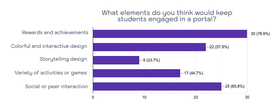
To deepen our understanding of student portal experiences and child-centered design, we developed a targeted 6-question survey using Google Forms. With 39 responses collected, the data revealed that progress tracking was the most valued feature among students. Additionally, the findings highlighted that rewards and achievement-based elements play a key role in sustaining student engagement and motivation throughout their learning journey.
COMPETITOR ANALYSIS

Ideate / Creating the Framework
Features and Priorities
Once the research was completed and the problem was understood from the users' point of view, a brainstorming session was held to explore potential solutions to generate solution-oriented ideas that could effectively address the challenges uncovered.
Focus on Visual Motivation
- Use colorful, encouraging visuals to make lessons inviting
-
Highlight small wins to reinforce continued participation

Design for Struggling Readers
Simplify content layout and reduce visual clutter
Use clear, readable fonts and child-friendly typography
-
Redesign Strategy – Based on Josh’s Needs
Create a Safe and Inclusive Environment
Design an interface that feels welcoming and supportive
Ensure the experience helps reduce feelings of isolation or comparison with peers
Make Learning Feel Active and Fun
- Integrate interactive animations and dynamic exercises
Build experiences that mimic the energy of recess and PE (Josh’s favorite parts of school)
Foster Confidence and Independence
-
Offer positive reinforcement and feedback at key points
-
Allow self-paced learning to reduce pressure and build self-esteem
Incorporate Gamified Elements
- Add rewards, badges, and achievement tracking to sustain engagement
Introduce progress bars and visual milestones to encourage momentum
Moodboard & inspiration


We wanted to create an experience where children felt like they were embarking on a journey. Drawing inspiration from games that we all found engaging as kids, we noticed a common theme, the use of maps. Whether in classic board games like Candyland and The Game of Life or more recent digital games like Minecraft and Animal Crossing, maps provide a sense of adventure.
User Flow
We streamlined the task flow of the student portal to create an intuitive and engaging experience. Key features like the onboarding tutorial, progress tracking, and phase-based lessons guide students step-by-step, ensuring a smooth transition between schoolwork and home learning.

Storyboard

Prototype / Let's make the Design !
Early Stage Wireframes

Each team member individual wireframes based on our initial ideas, allowing us to explore different approaches to the portal design. We then came together, combining the best elements from each wireframe to collaboratively build a cohesive low-fidelity prototype that would guide our next steps
Low-Fi Prototype

Mid-Fi Prototype

Branding & Style Tile


Test / Time to test the Prototype !
Usability Test Findings
Low-Fidelity Prototype:
In our low-fidelity test, we focused on gathering initial feedback on the overall structure and functionality of the portal. These tests provided valuable insights into how students navigated the interface, allowing us to make early adjustments to improve usability before moving to higher-fidelity prototypes.
To conduct user testing with children, we created a detailed permission process for parents and guardians, ensuring transparency about the testing procedures. This allowed us to ethically gather feedback from our target audience while addressing any concerns about participation.
HIGH-Fi Prototype
Usability Test Findings
We conducted 15 usability tests, five at each fidelity level, to gather insights on how well the portal worked for children. Each round provided us with useful feedback, helping us fine-tune the design to make it more intuitive and child-friendly. Overall, the feedback was very positive, with only minor tweaks needed, like adjusting buttons and icons for better clarity.
During our testing, we had the opportunity to test the portal with our stakeholders’ children. They were so engaged and excited by the product that after the test, they couldn’t stop asking their dad if they could play the game again. This kind of response gave us confidence that the portal was not only effective but also genuinely fun for our young users.
After conducting rounds of testing on our low, mid, and high-fidelity prototypes, we arrived at the final design.


Mid-Fi Prototype:
In the mid-fidelity user test, we identified that the "Get Started" button was recently overlooked, which disrupted the onboarding experience. This insight let us to redesign the button for better visibility and streamline the user flow to ensure smoother navigation for students.

High-Fi Prototype:
In the high-fidelity user test, we found that users were often confused between the starting points for lessons and the tutorial. These findings guided us in simplifying the overall experience to create a more intuitive and user-friendly portal.

Implement / Final design & Next Steps


Final Thoughts
-
Through this process, I've realized how crucial it is to transform traditional education methodologies into more modern and interactive approaches that genuinely motivate children to enhance their learning experience.
-
Technology plays a vital role in today's society, making it essential to transition into this boundless realm of possibilities where education can be accelerated and expanded by reaching children in their homes.
-
Collaborating with a stakeholder is incredibly rewarding, as it allows you to make a meaningful impact on someone's vision and project.
-
Teamwork is a fulfilling experience when you, as a creative, can express your ideas and merge them with those of others, turning concepts into tangible products and navigating that journey together.
NEXT STEPS...
-
Our next steps involve fully building out the remaining phases of the student portal, including refining the design and enhancing functionality based on user feedback.
-
We will also collaborate closely with Readable English and our stakeholder to ensure successful implementation and continue user testing to optimize the portal's performance and user experience.